


A luxury brand is rarely remembered because of its logo alone. More often, it's the colours that leave a lasting impression. efore someone reads your headline, browses your products, or watches your ad, they subconsciously judge your brand by its visual identity. That's why choosing the right luxury color palette is one of the most important branding decisions you will make.
From Chanel's timeless black and white to Tiffany & Co.'s iconic blue, luxury brands understand that colours communicate quality, trust, and exclusivity before a single word is spoken. Luxury palettes typically combine deep anchor colours like black, charcoal, navy, or emerald with warm neutrals and subtle metallic accents. The result feels sophisticated instead of overwhelming.
If you are creating product photos or marketing creatives, maintaining colour consistency can be just as important as choosing the colours themselves. That's where Blend comes in. Once you have picked your palette, you can use Blend to create professional product images, lifestyle visuals, and branded marketing assets that consistently reflect your luxury aesthetic across every platform.
Below are some of the most timeless luxury colour palettes you can use for your own brand.
1. Black and Gold Luxury Color Palette - Gilded Noir
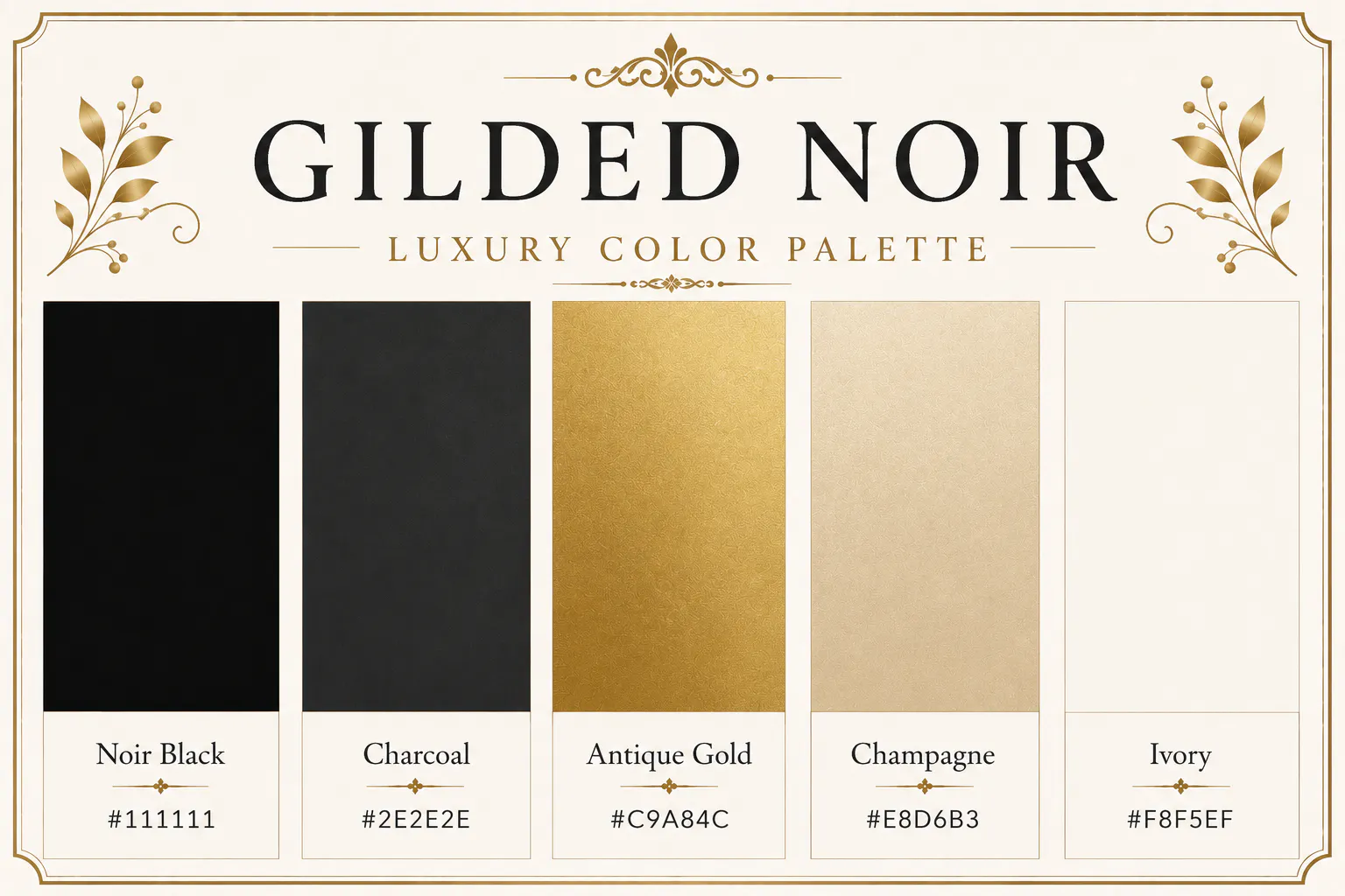
Black and gold remain the ultimate symbol of luxury. Black adds authority and sophistication, while muted gold introduces warmth without becoming flashy. This palette works exceptionally well for jewellery brands, luxury fashion labels, premium consulting firms, and upscale restaurants.
Noir Black - #111111
Charcoal - #2E2E2E
Antique Gold - #C9A84C
Champagne - #E8D6B3
Ivory - #F8F5EF
Best for: Jewellery, watches, fashion, luxury packaging, premium websites
RELATED READING: https://www.blendnow.com/blog/create-consistent-brand-backgrounds-with-ai
2. Champagne and Ivory Luxury Color Palette - Champagne Pearl
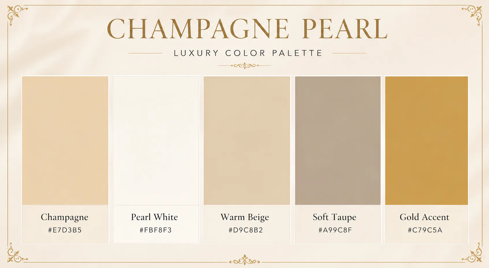
If your brand leans towards elegance rather than drama, this palette is a beautiful choice. Soft champagne and pearl white create an airy, expensive look that's especially popular among bridal businesses, skincare brands, and luxury event planners.
Champagne - #E7D3B5
Pearl White - #FBF8F3
Warm Beige - #D9C8B2
Soft Taupe - #A99C8F
Gold Accent - #C79C5A
Best for: Wedding brands, skincare, cosmetics, luxury invitations
3. Emerald Green Luxury Color Palette - Emerald Velvet
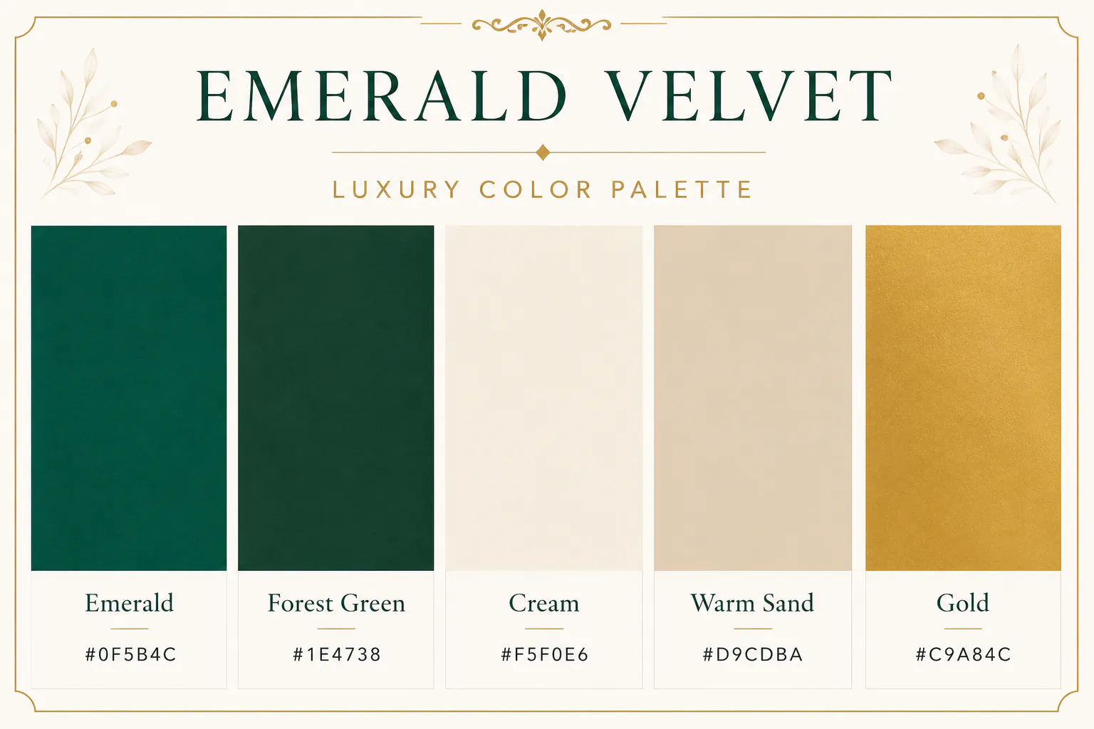
Emerald green has become one of the defining colours of modern luxury. It feels rich, confident, and timeless without relying on black. Pair it with cream backgrounds and subtle gold accents to create a premium identity that feels fresh rather than traditional.
Emerald - #0F5B4C
Forest Green - #1E4738
Cream - #F5F0E6
Warm Sand - #D9CDBA
Gold - #C9A84C
Best for: Wellness, luxury interiors, organic beauty brands
4. Navy Blue Luxury Color Palette - Sapphire Lounge
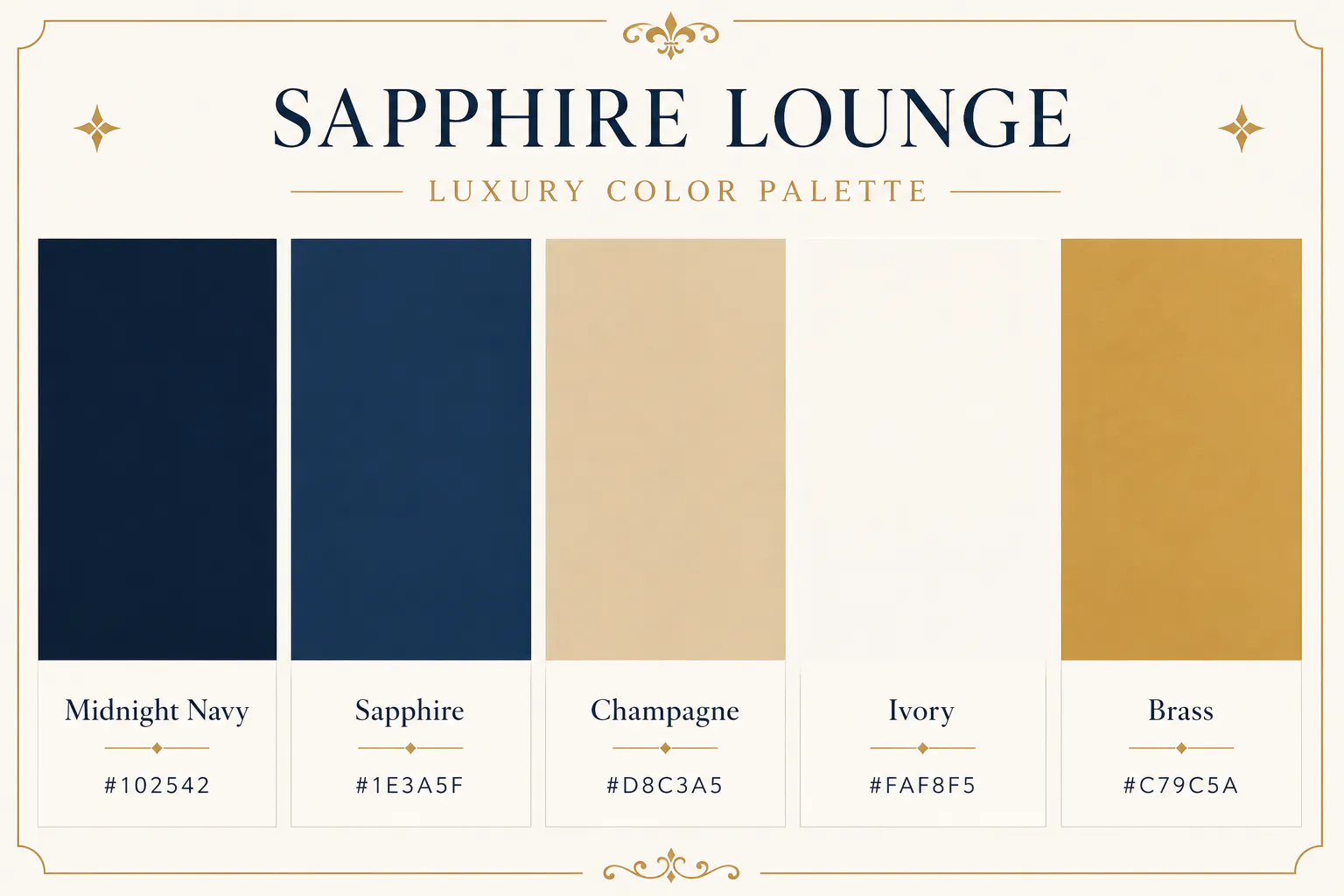
Deep navy communicates trust, stability, and prestige. When paired with champagne and ivory, it creates a refined palette that's ideal for premium corporate brands, luxury hotels, and financial businesses.
Midnight Navy - #102542
Sapphire - #1E3A5F
Champagne - #D8C3A5
Ivory - #FAF8F5
Brass - #C79C5A
Best for: Finance, consulting, hospitality, luxury real estate
RELATED READING: How to Generate Lifestyle Scenes That Match Your Brand Colors with AI
5. Rose Gold Luxury Color Palette - Rose Gold Dusk
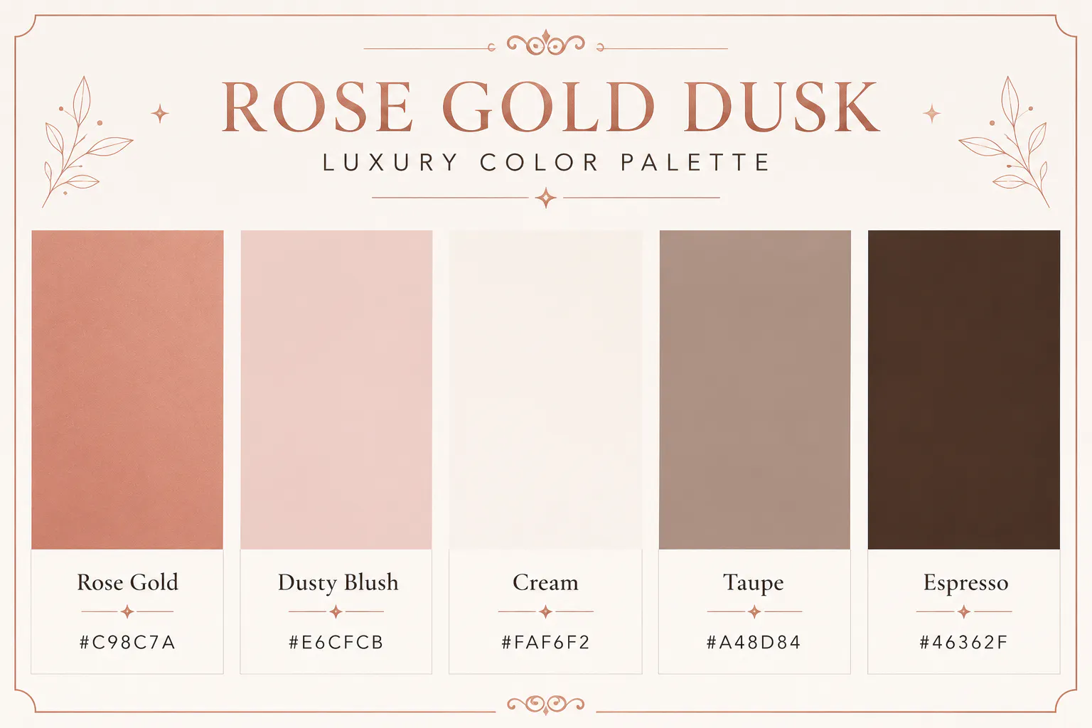
Rose gold offers a softer interpretation of luxury. Combined with blush and warm neutrals, it creates an inviting aesthetic that feels feminine without becoming overly decorative.
Rose Gold - #C98C7A
Dusty Blush - #E6CFCB
Cream - #FAF6F2
Taupe - #A48D84
Espresso - #46362F
Best for: Beauty brands, fashion boutiques, jewellery
6. Brown Luxury Color Palette - Mocha Silk
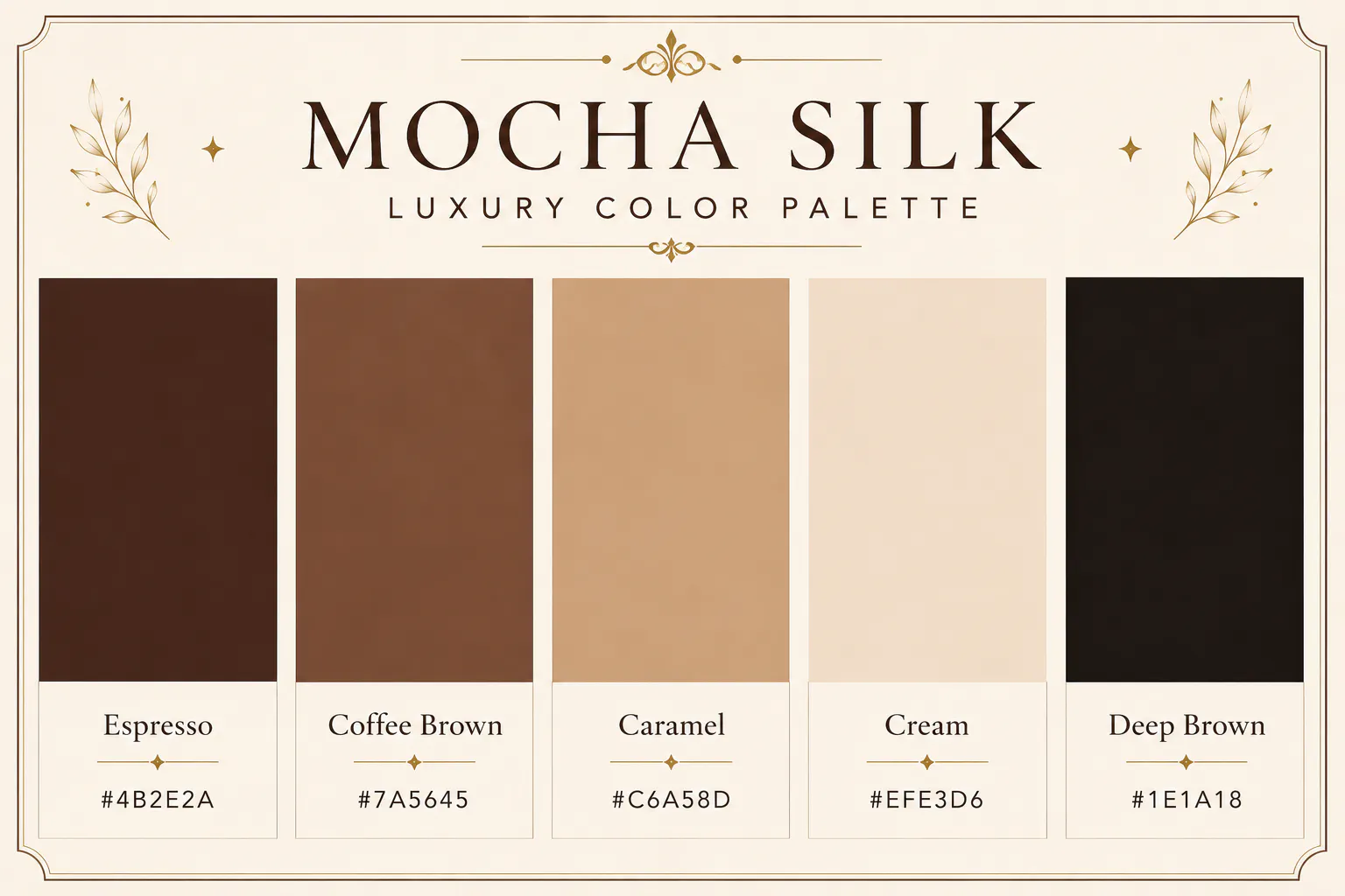
Inspired by coffee, leather, and handcrafted materials, this palette feels warm and luxurious. It works particularly well for cafés, artisan food brands, leather goods, and premium packaging.
Espresso - #4B2E2A
Coffee Brown - #7A5645
Caramel - #C6A58D
Cream - #EFE3D6
Deep Brown - #1E1A18
Best for: Coffee brands, artisan products, luxury packaging
7. White Marble Luxury Color Palette - Marble Elegance
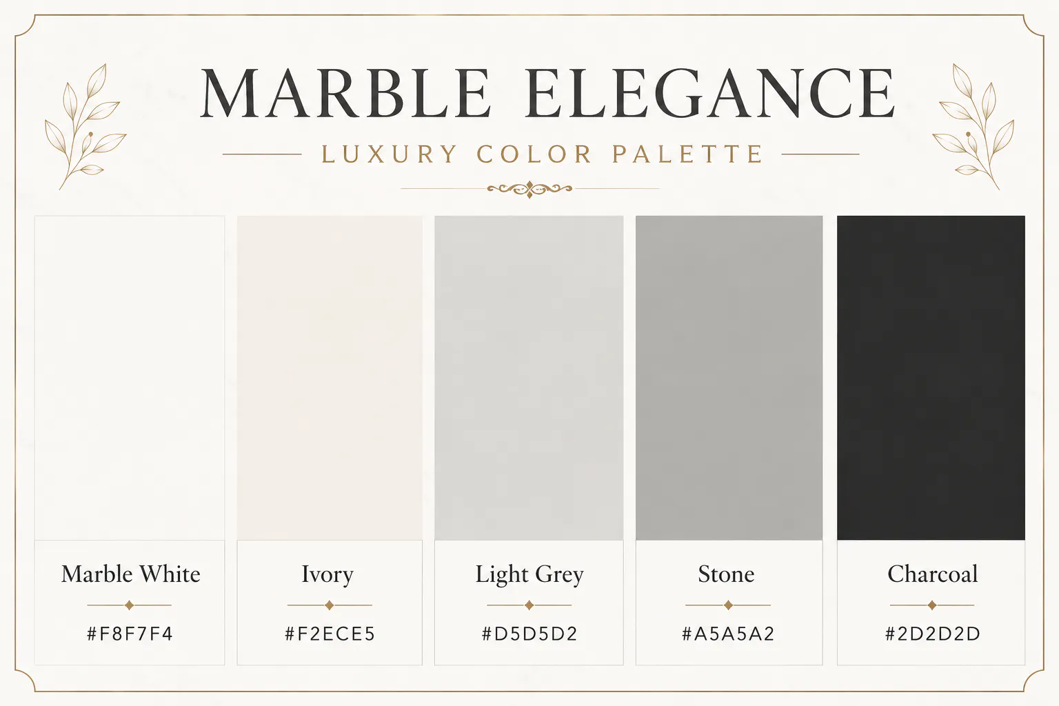
Luxury doesn't always need dark colours. Marble Elegance or Ivory Marble proves that soft neutrals can feel just as premium. Inspired by marble interiors, this palette is clean, timeless, and incredibly versatile.
Marble White - #F8F7F4
Ivory - #F2ECE5
Light Grey - #D5D5D2
Stone - #A5A5A2
Charcoal - #2D2D2D
Best for: Architecture, home décor, premium lifestyle brands
8. Plum and Gold Luxury Color Palette - Plum Regent
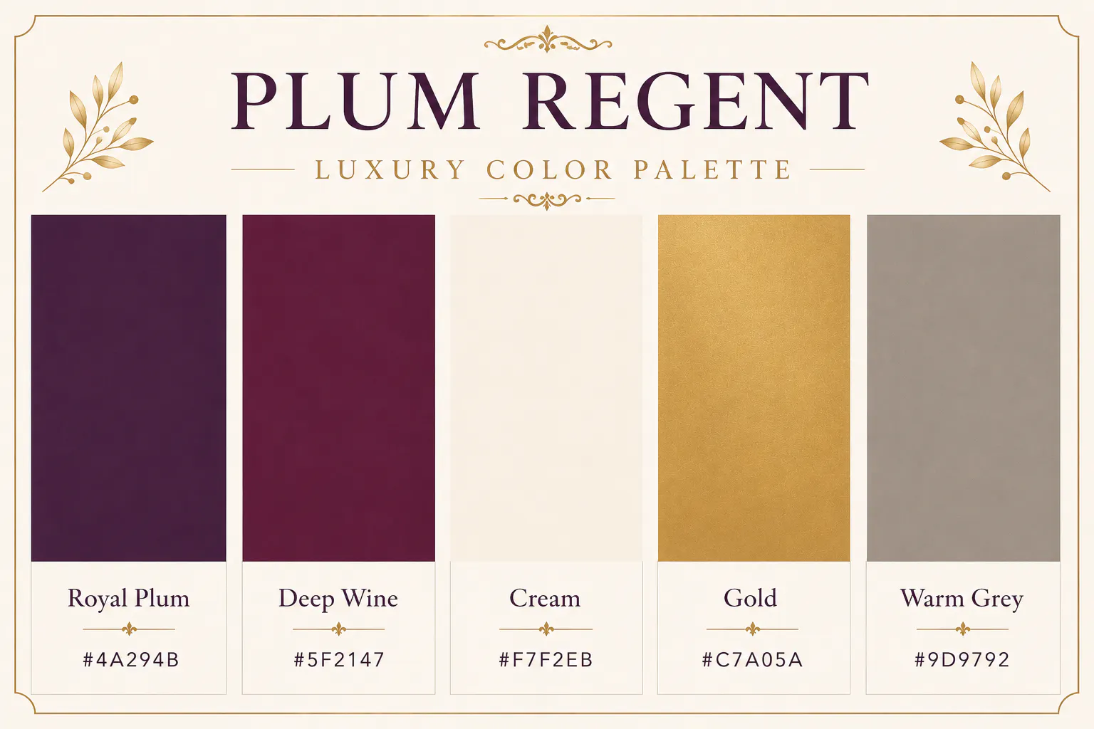
Plum is dramatic without feeling loud. It creates a regal atmosphere that's perfect for premium beauty brands, boutique hotels, and high-end restaurants.
Royal Plum - #4A294B
Deep Wine - #5F2147
Cream - #F7F2EB
Gold - #C7A05A
Warm Grey - #9D9792
Best for: Hospitality, luxury beauty, fine dining
9. Copper and Brown Luxury Color Palette - Copper Cashmere
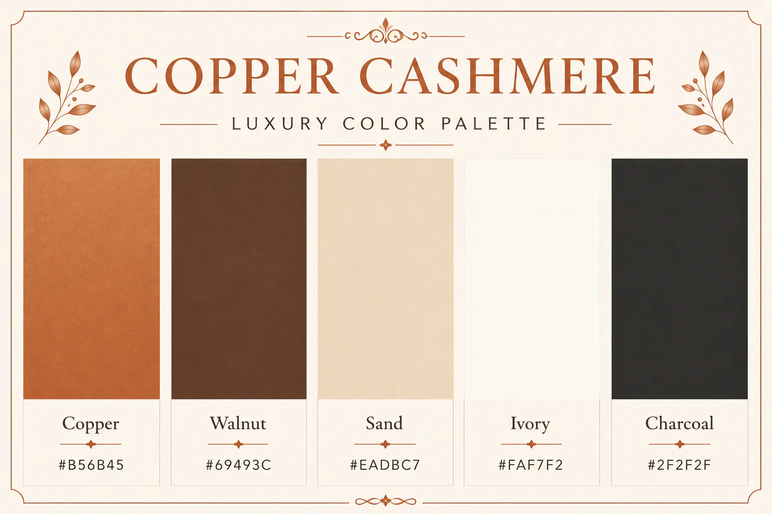
Copper brings warmth that traditional gold sometimes lacks. When paired with soft neutrals and rich browns, it creates a welcoming premium aesthetic.
Copper - #B56B45
Walnut - #69493C
Sand - #EADBC7
Ivory - #FAF7F2
Charcoal - #2F2F2F
Best for: Interior design, candles, furniture brands
10. Purple Luxury Color Palette - Midnight Orchid
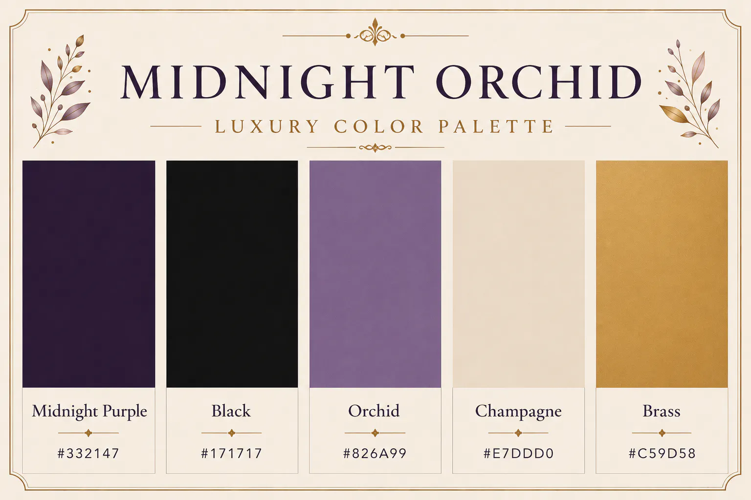
This palette combines deep purple with charcoal and soft metallic accents to create a mysterious yet elegant identity. It's perfect if your brand wants to stand out while maintaining a premium appearance.
Midnight Purple - #332147
Black - #171717
Orchid - #826A99
Champagne - #E7DDD0
Brass - #C59D58
Best for: Luxury cosmetics, fragrance, premium gifting
11. Black and Cream Luxury Color Palette - Caviar & Cream
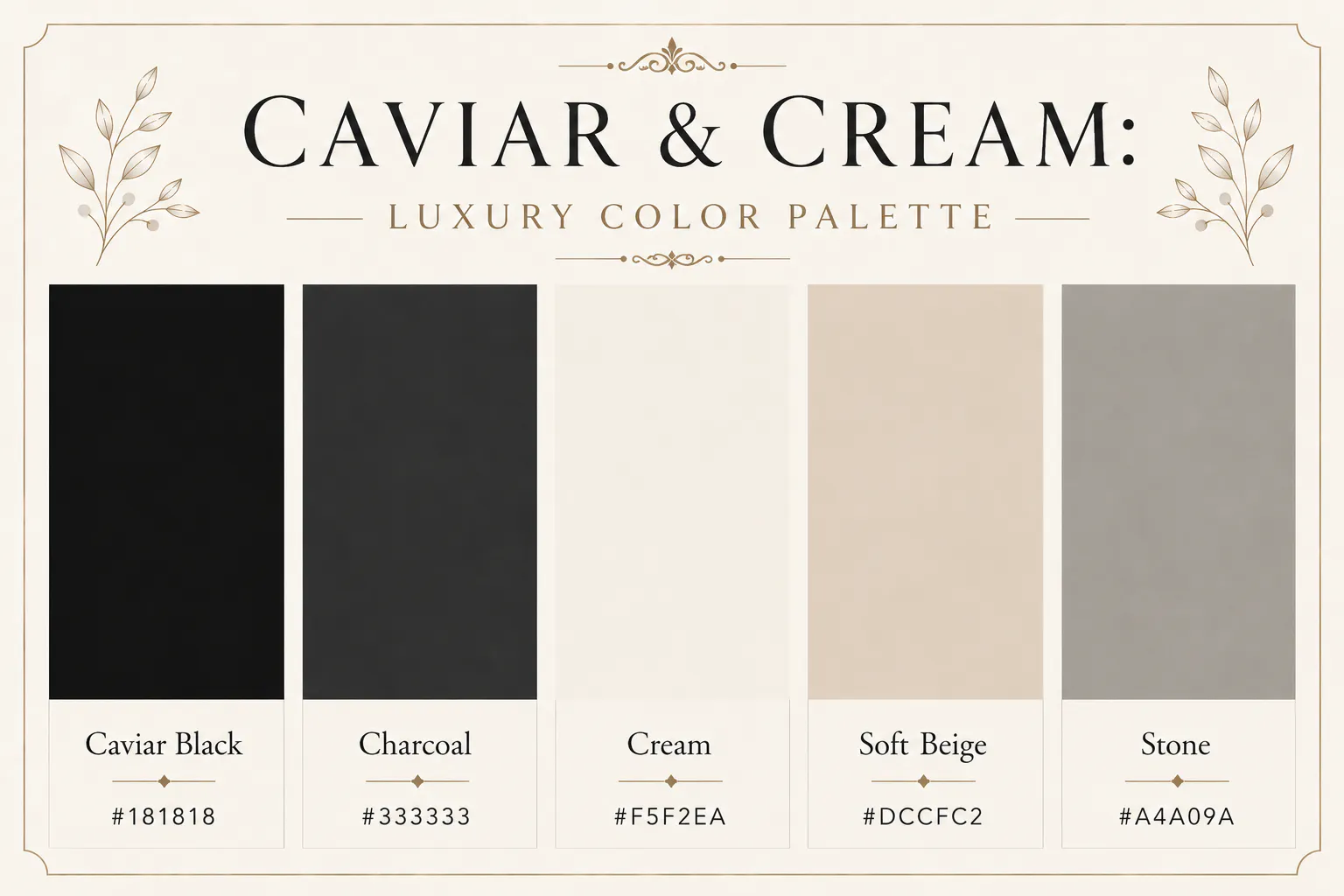
Sometimes simplicity creates the strongest impression. Caviar & Cream relies almost entirely on contrast, using rich black with warm cream backgrounds for a clean, editorial look.
Caviar Black - #181818
Charcoal - #333333
Cream - #F5F2EA
Soft Beige - #DCCFC2
Stone - #A4A09A
Best for: Fashion, editorial websites, luxury portfolios
12. Forest Green Luxury Color Palette - Forest Reserve
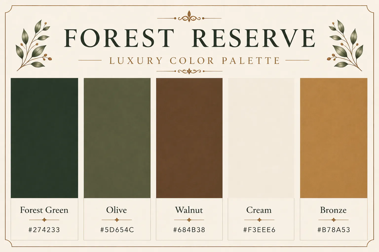
Inspired by private estates and heritage architecture, Forest Reserve combines earthy greens with walnut and cream to create a refined natural palette.
Forest Green - #274233
Olive - #5D654C
Walnut - #684B38
Cream - #F3EEE6
Bronze - #B78A53
Best for: Resorts, eco-luxury brands, furniture
13. Burgundy and Bronze Luxury Color Palette - Antique Brocade
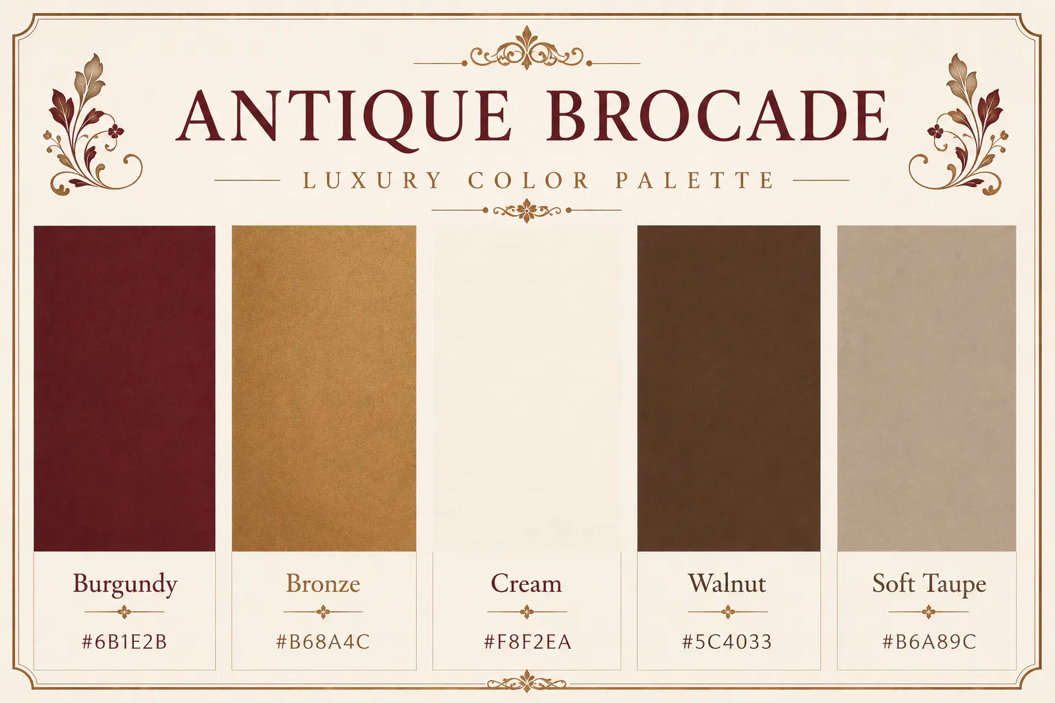
Antique Brocade draws inspiration from vintage textiles, classic European interiors, and heritage craftsmanship. Burgundy and bronze work together beautifully to create a palette that feels rich, elegant, and timeless.
Burgundy - #6B1E2B
Bronze - #B68A4C
Cream - #F8F2EA
Walnut - #5C4033
Soft Taupe - #B6A89C
Best for: Luxury hotels, premium restaurants, artisan brands
14. Teal and Gold Luxury Color Palette - Royal Teal
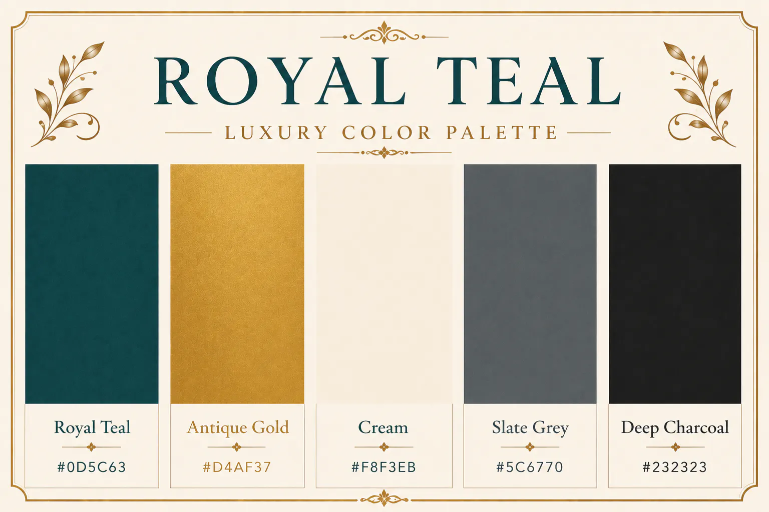
Teal sits between blue and green, giving you the best of both worlds. It feels dependable like navy but fresher and more contemporary. When paired with soft cream and antique gold, it creates a sophisticated palette that's bold without feeling overwhelming.
Luxury wellness brands, boutique hotels, and premium lifestyle companies often use teal because it communicates confidence, calmness, and exclusivity. If your brand wants to look modern while maintaining a timeless appeal, this combination is an excellent choice.
Royal Teal - #0D5C63
Antique Gold - #D4AF37
Cream - #F8F3EB
Slate Grey - #5C6770
Deep Charcoal - #232323
Best for: Wellness brands, premium hospitality, luxury travel, interior design
15. Terracotta Luxury Color Palette - Desert Luxe
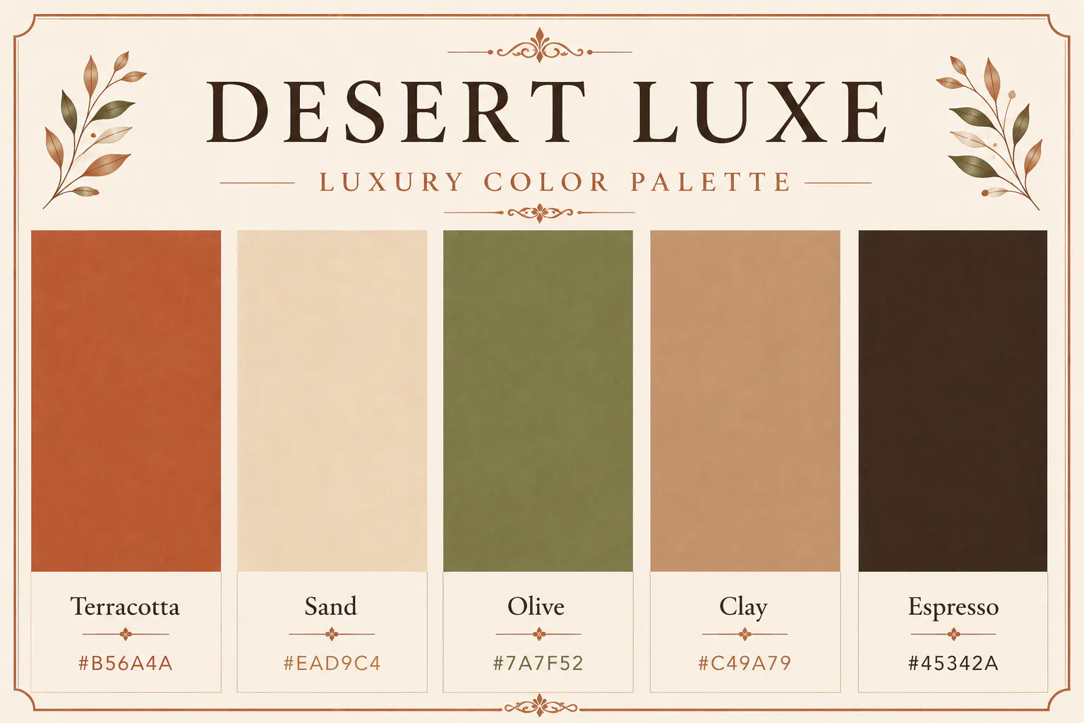
Inspired by natural landscapes, Desert Luxe feels warm, grounded, and quietly luxurious. Terracotta, olive, and sand create an earthy palette that has become increasingly popular with premium home décor, eco-conscious brands, and boutique fashion labels. Unlike cooler luxury palettes, this one feels inviting and relaxed without losing its premium appeal.
Terracotta - #B56A4A
Sand - #EAD9C4
Olive - #7A7F52
Clay - #C49A79
Espresso - #45342A
Best for: Sustainable brands, furniture, ceramics, home décor
16. Neutral Luxury Color Palette - Cashmere Neutrals
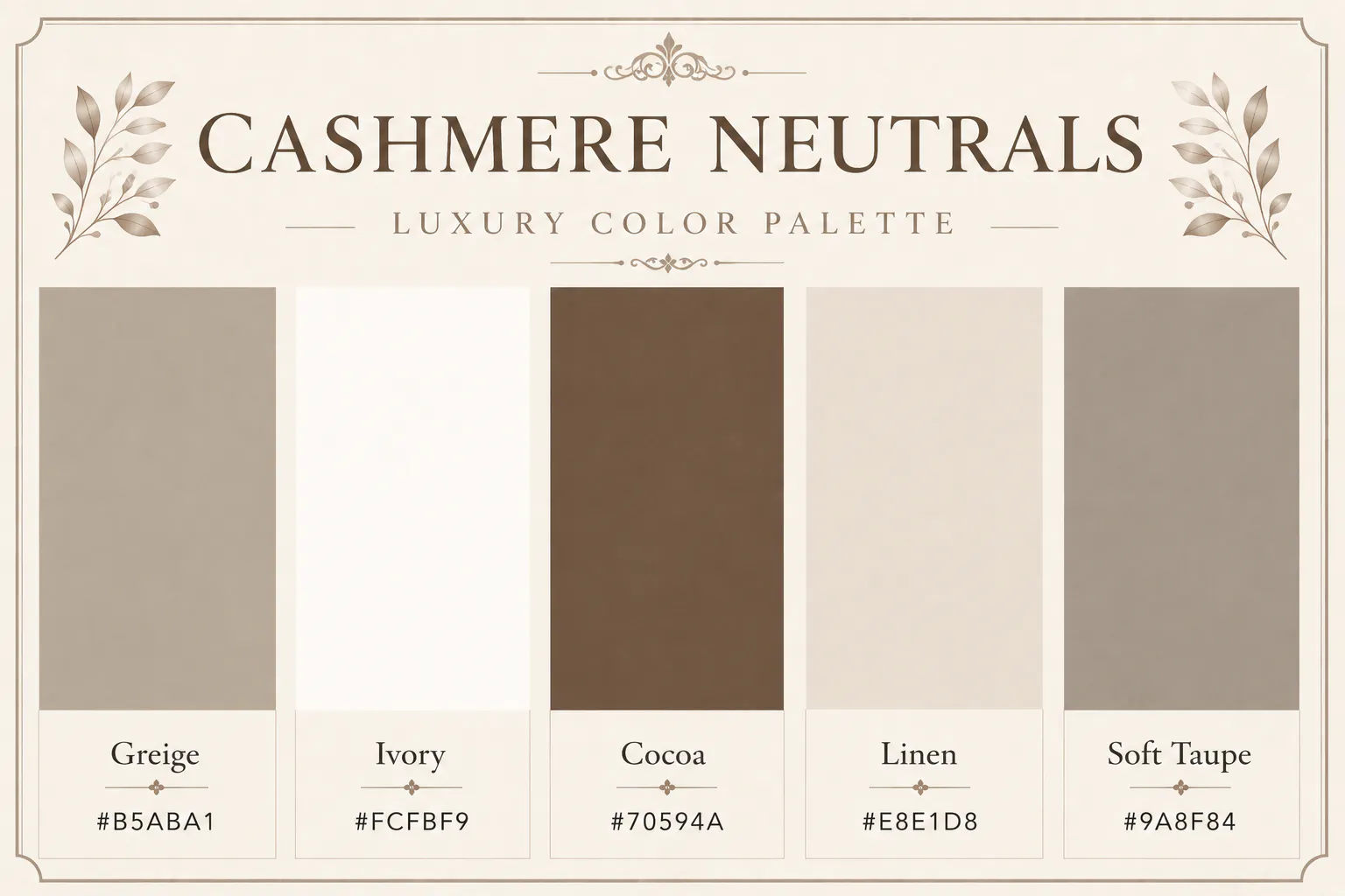
Quiet luxury has influenced modern branding more than almost any other design trend. This palette captures that aesthetic with soft greige, warm ivory, and cocoa brown.
These colours don't demand attention. They earn it through elegance and simplicity. If your goal is to create a timeless brand that won't feel dated next year, this is one of the safest choices.
Greige - #B5ABA1
Ivory - #FCFBF9
Cocoa - #70594A
Linen - #E8E1D8
Soft Taupe - #9A8F84
Best for: Luxury fashion, furniture, premium stationery
17. Sapphire Blue Luxury Color Palette - Sapphire Estate
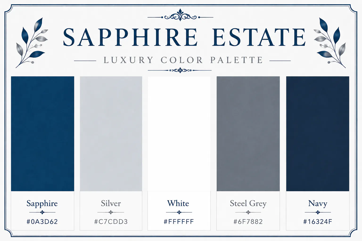
Deep sapphire blue immediately creates a sense of authority and trust. Adding silver and crisp white keeps the palette polished and contemporary.
This combination works particularly well for businesses that want to look prestigious while remaining approachable.
Sapphire - #0A3D62
Silver - #C7CDD3
White - #FFFFFF
Steel Grey - #6F7882
Navy - #16324F
Best for: Finance, legal firms, premium technology
18. Lavender Luxury Color Palette - Lavender Manor
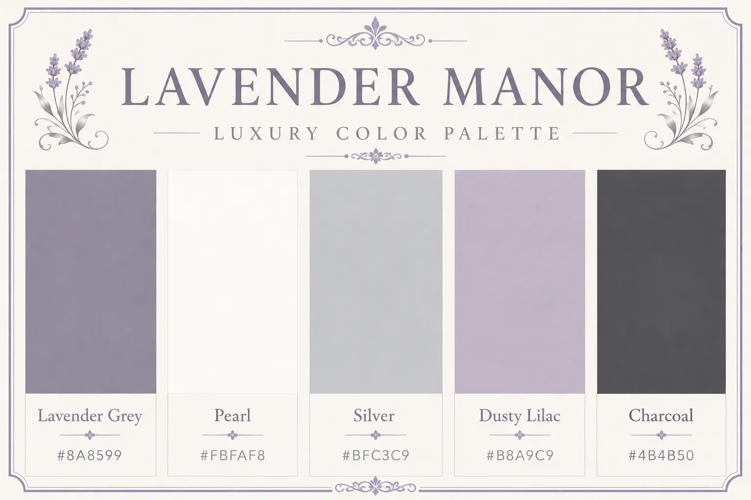
Soft lavender has become increasingly popular in luxury beauty and wellness because it feels calming without appearing childish. Combined with silver and pearl white, it creates an elegant, feminine aesthetic.
Lavender Grey - #8A8599
Pearl - #FBFAF8
Silver - #BFC3C9
Dusty Lilac - #B8A9C9
Charcoal - #4B4B50
Best for: Spas, skincare, luxury cosmetics, wellness
19. Black and Emerald Luxury Color Palette - Noir Emerald
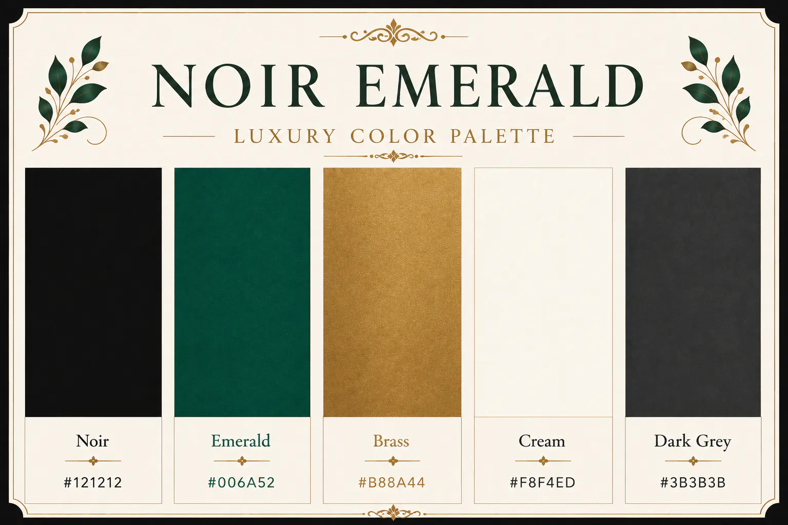
This dramatic combination pairs deep black with rich emerald and muted brass. It feels bold, exclusive, and timeless without relying on bright colours.
If you are designing a restaurant, cocktail bar, luxury fashion label, or premium packaging, this palette immediately communicates sophistication.
Noir - #121212
Emerald - #006A52
Brass - #B88A44
Cream - #F8F4ED
Dark Grey - #3B3B3B
Best for: Restaurants, fashion, premium branding
20. Silver Luxury Color Palette - Frosted Silver
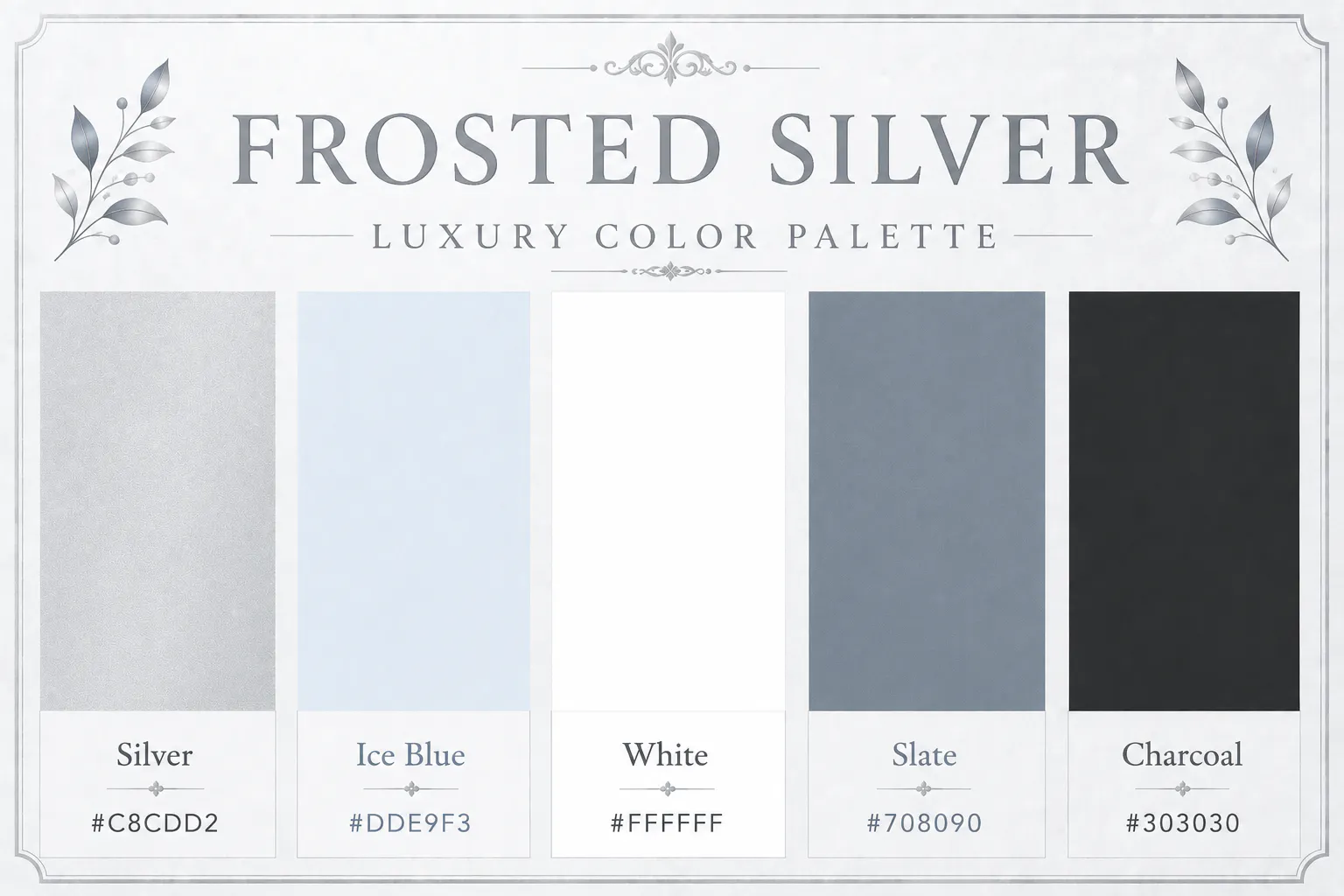
If your brand leans towards technology or innovation, Frosted Silver offers a clean luxury aesthetic. The combination of silver, icy blue, and white feels modern, precise, and premium.
It's particularly effective for premium electronics, software companies, and luxury gadgets.
Silver - #C8CDD2
Ice Blue - #DDE9F3
White - #FFFFFF
Slate - #708090
Charcoal - #303030
Best for: Technology, electronics, premium apps
21. Olive Green Luxury Color Palette - Olive Manor
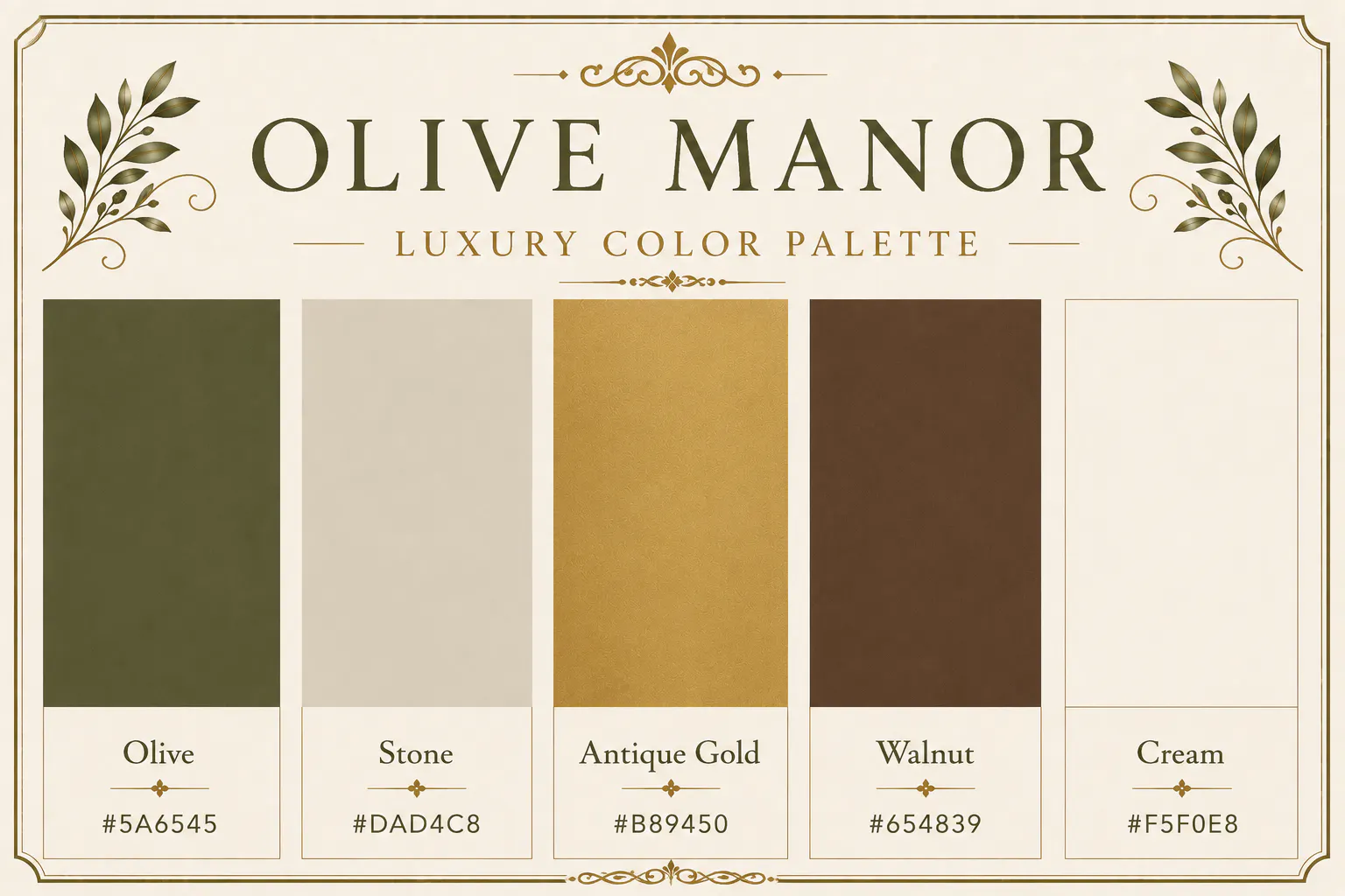
Olive green has a timeless quality that pairs beautifully with stone and muted gold. It feels mature, sophisticated, and connected to nature.
Brands focused on craftsmanship or sustainability often choose this palette because it balances luxury with authenticity.
Olive - #5A6545
Stone - #DAD4C8
Antique Gold - #B89450
Walnut - #654839
Cream - #F5F0E8
Best for: Organic products, furniture, hotels
22. Chocolate Brown Luxury Color Palette - Chocolate Reserve
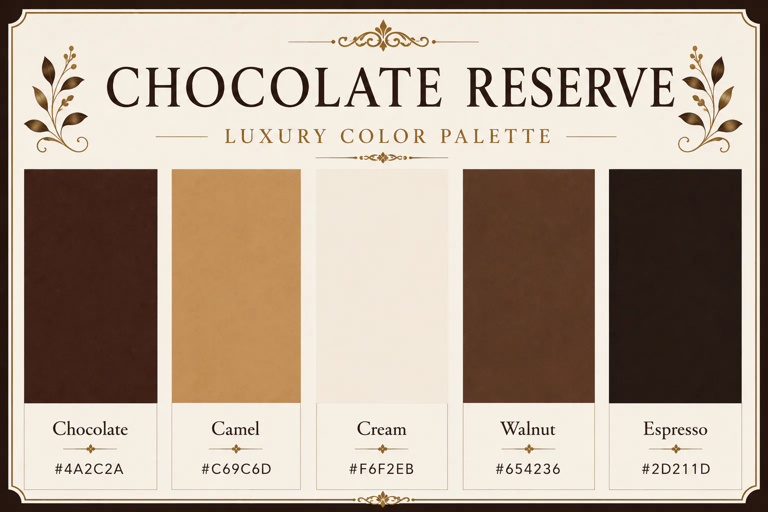
Rich brown tones often remind people of leather, wood, coffee, and handcrafted goods—all materials associated with premium quality. Chocolate Reserve creates warmth while maintaining an elegant appearance.
Chocolate - #4A2C2A
Camel - #C69C6D
Cream - #F6F2EB
Walnut - #654236
Espresso - #2D211D
Best for: Leather goods, coffee brands, premium gifting
23. Blush Pink Luxury Color Palette - Pearl Blush
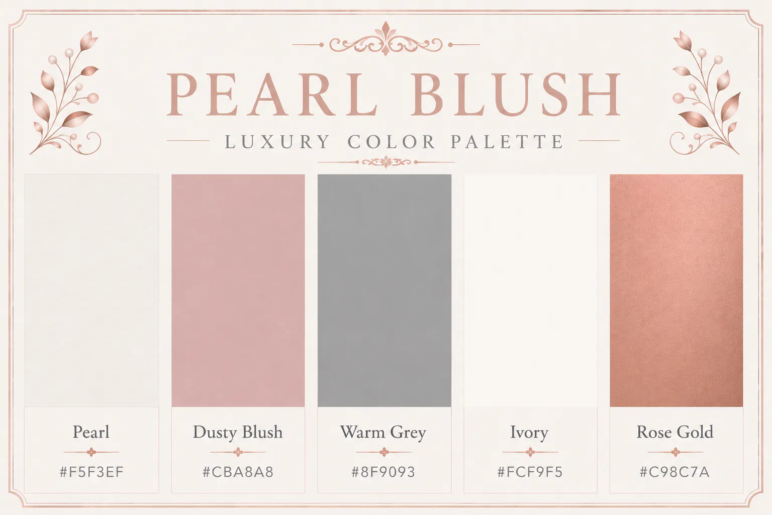
Pearl Blush combines soft pink with warm neutrals to create an elegant palette that's understated rather than overly feminine. It works wonderfully for jewellery, bridal businesses, premium stationery, and beauty brands.
Pearl - #F5F3EF
Dusty Blush - #CBA8A8
Warm Grey - #8F9093
Ivory - #FCF9F5
Rose Gold - #C98C7A
Best for: Weddings, beauty, jewellery
24. Grey Luxury Color Palette - Graphite Luxe
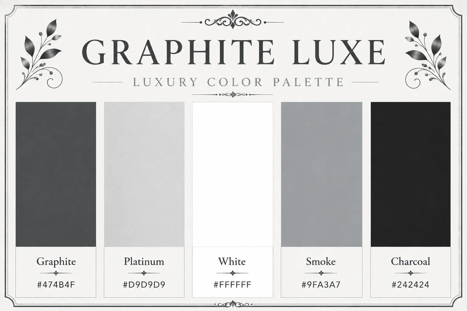
Graphite offers a softer alternative to black while retaining a premium look. Combined with platinum and white, it creates a minimalist palette that's clean, professional, and incredibly versatile.
Graphite - #474B4F
Platinum - #D9D9D9
White - #FFFFFF
Smoke - #9FA3A7
Charcoal - #242424
Best for: Architecture, luxury portfolios, premium SaaS
25. Burgundy Luxury Color Palette - Heritage Burgundy
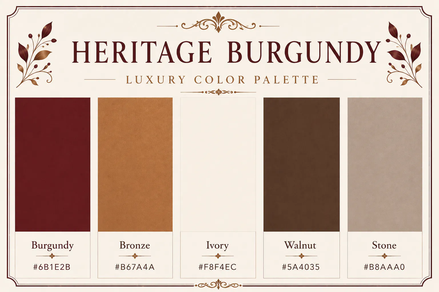
The final palette takes inspiration from heritage hotels, classic libraries, and vintage craftsmanship. Burgundy and bronze create richness, while ivory keeps the palette balanced.
If your brand wants to communicate tradition, expertise, and timeless quality, Heritage Burgundy is an excellent choice.
Burgundy - #6B1E2B
Bronze - #B67A4A
Ivory - #F8F4EC
Walnut - #5A4035
Stone - #B8AAA0
Best for: Hospitality, wine brands, premium restaurants
RELATED READING: AI Photo Editing for Luxury and High-End Product Brands
How to Use a Luxury Color Palette Across Your Brand
Choosing a palette is only the first step. The real challenge is using those colors consistently everywhere your audience interacts with your business.
Start by assigning a purpose to each colour. Your darkest shade should usually become the primary brand colour, while lighter neutrals work best for backgrounds and spacious layouts. Reserve metallic tones or bold accents for buttons, highlights, or important calls to action. This prevents your designs from feeling cluttered and helps create a refined, premium look.
Consistency is equally important. If your website uses charcoal and champagne but your social media graphics switch to bright blue or vivid red, your brand immediately feels less cohesive. Luxury brands build recognition by repeating the same visual language across websites, advertisements, packaging, emails, and printed materials.
Create Premium Visuals with Blend
Once you have chosen your luxury color palette, every visual you create should reinforce it. Product photos, website banners, social media posts, and online ads should all feel like they belong to the same brand. That's where Blend can save you a significant amount of time.
Instead of manually editing every image, you can use Blend to remove distracting backgrounds, create clean product photography, generate lifestyle scenes, and produce polished marketing creatives. By applying your chosen palette consistently across these assets, your brand instantly looks more professional and memorable.
Whether you are launching a skincare line, promoting luxury furniture, or selling handmade jewellery, maintaining visual consistency helps build trust and strengthens your premium identity.
Common Mistakes to Avoid
Many businesses choose beautiful colours but use them inconsistently. One common mistake is introducing too many accent colours. Luxury design relies on restraint, so limiting your palette to three to five primary shades usually creates a stronger impression.
Another mistake is using pure black and bright white everywhere. Softer alternatives such as charcoal, ivory, cream, or warm grey often create a more refined appearance.
Finally, don't forget that colours work alongside typography, photography, and spacing. Even the best luxury color palette won't feel premium if your layout is cluttered or your images lack consistency.
Conclusion
A thoughtfully chosen luxury color palette does more than improve the look of your website or packaging. It shapes how people perceive your brand. Once you have selected a palette that reflects your business, apply it across every touchpoint, from your logo and packaging to your social media posts and advertising campaigns.
If you are creating product visuals or marketing content, tools like Blend make that process much easier. With polished product photography, clean backgrounds, and professionally designed marketing assets, you can showcase your chosen colour palette consistently and present your brand with the premium look it deserves.